I'm thankful for all the nice replies, but also let me clarify something: I didn't think of it as complaining. People can have their opinions and share them without demanding anything, and that's the usual attitude with these posts. I also don't think I'm infallible so it can be helpful if someone points out a flaw I missed. It can be annoying when it's about things I already spent a lot of time thinking about or when this is the best I can do, but how are they supposed to know?
The problem is that I want to make emojis without a border for once. If you look at or or most other of my emojis, you'll see that they in fact have one. White borders don't work because on dark backgrounds, what they do is pulling all of your attention and blinding you to the actual emoji itself. It would be harder to read than without a border.
Honestly, a lot of it also comes down to emojis as a concept just being overall not well thought-out. I recently complained about how they're handled in software, too.
What we need are two things: - Emoji variations that are selected depending on the background. This would fix many design issues. - An API to enumerate emojis so that software devs don't need to reinvent the same thing over and over and over again. Applications only need to ship their own emojis because they can't detect if an emoji is available or not. It wouldn't look good if there were Unicode character placeholders in the picker.
It sucks that I want to lash out when people say an emoji I made is hard to see on certain backgrounds, or that they dislike the outline, etc. It's not that they're wrong, but here are the facts:
- I am painfully aware about legibility on various backgrounds. - Ensuring good legibility on dark backgrounds means using a lighter color. But then the color starts looking too different from what it should be. Crows are black. - Also side-note: Crows don't glow when you look at them in the dark, so it's actually pretty realistic if the emojis aren't 100% visible on dark backgrounds. - I'm fed up with restricting my imagination when all the other emoji makers - and I'm talking about the big ones like Google, Microsoft etc - allow themselves to not give a shit all the time. The gray I chose has the same lightness as Noto's blackbird emoji. It is lighter than the gray in various other emojis.
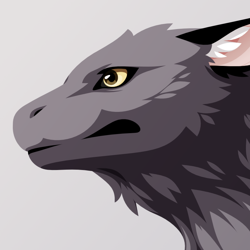
@hj I really wanted to not have an outline this time. And yet, most people prefer it in the poll because what a surprise, emojis can be hard to see depending on the background color. I hate this.
 Volpeon