
It sucks that I want to lash out when people say an emoji I made is hard to see on certain backgrounds, or that they dislike the outline, etc. It's not that they're wrong, but here are the facts:
- I am painfully aware about legibility on various backgrounds.
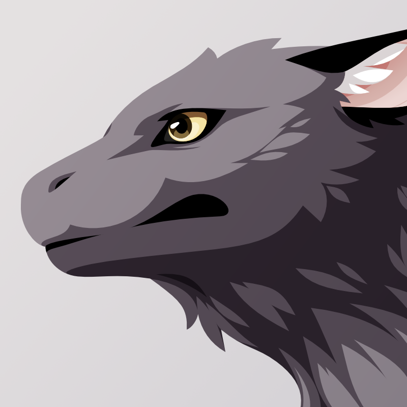
- Ensuring good legibility on dark backgrounds means using a lighter color. But then the color starts looking too different from what it should be. Crows are black.
- Also side-note: Crows don't glow when you look at them in the dark, so it's actually pretty realistic if the emojis aren't 100% visible on dark backgrounds.
- I'm fed up with restricting my imagination when all the other emoji makers - and I'm talking about the big ones like Google, Microsoft etc - allow themselves to not give a shit all the time. The gray I chose has the same lightness as Noto's blackbird emoji. It is lighter than the gray in various other emojis.