
User avatar
privTri Volpeon areonNSmol @volpeon@icy.wyvern.rip
Admin
Wyvern-shaped software developer and hobby vector artist. Also sometimes a fluffy werewolf alien creature (Areon).

Creator of the neofoxes, neocats and other emojis.
wvrnBox
Website
https://volpeon.ink/
Speaking German, English
Age 30s
Pronouns he / him
Backup Account @volpeon@goto.wyvern.rip
Bonus Content @areon@icy.wyvern.rip
User avatar
privTri Volpeon areonNSmol @volpeon@icy.wyvern.rip
1y
The problem is that these projects aren't easily discoverable and integrated into the user interface, unlike Bluesky. You can't convince me that they're even remotely as usable or convenient as this: (see attachments)

Fedi has a tendency to handwave legitimate usability concerns because a lot of people here are more technically inclined than the average person. It's frustrating because it only blocks the way for better solutions.

RE
social.chinwag.org/@FediThing/113469817542409948
User avatar
privTri Volpeon areonNSmol @volpeon@icy.wyvern.rip
1y
It's about to be that time again
User avatar
privTri Volpeon areonNSmol @volpeon@icy.wyvern.rip
1y
@raccoon @volpeon This one? neofox_3c
User avatar
privTri Volpeon areonNSmol @volpeon@icy.wyvern.rip
1y
@sirlan There are 3 parts to it:
- Icons:
git.vulpes.one/iro-icons/
- Sass framework:
git.vulpes.one/iro-sass/
- Design system:
git.vulpes.one/iro-design/

The design system also has Pug templates so I can quickly prototype components.

Don't expect much in terms of commit quality.
drgn_woozy
User avatar
privTri Volpeon areonNSmol @volpeon@icy.wyvern.rip
1y
AAAAAAAAAA MONDAY
User avatar
privTri Volpeon areonNSmol @volpeon@icy.wyvern.rip
1y
I'm really happy with my website redesign. I'm getting lots of cool components for future projects out of it, I'm working with a framework that's way more fun (but also more complicated) to use than Hugo, I made a new logo where I used negative space for the first time, I got my mobile UX knowledge up-to-date, and the website looks fucking great. drgn_happy_mlem
User avatar
privTri Volpeon areonNSmol @volpeon@icy.wyvern.rip
1y
@natty That one comes with an unexpected surprise, by the way: My sticky header stopped following after a while. So if you want the header to work normally, you have to not make the body scrollable but the main element instead. But then other (mostly JS-related) things stop working properly because they operate with the assumption that the root container is scrollable. It's such a mess. wvrnFlat
User avatar
privTri Volpeon areonNSmol @volpeon@icy.wyvern.rip
1y
@erincandescent The cool thing about position: sticky is that it reserves the space of the element which gets really important when the footer's height isn't static
User avatar
privTri Volpeon areonNSmol @volpeon@icy.wyvern.rip
1y
@natty Which is less straightforward than "header { position: sticky; inset-block-start: 0 }", which is what I was talking about.
User avatar
privTri Volpeon areonNSmol @volpeon@icy.wyvern.rip
1y
It's a bit silly that we have "position: sticky" in CSS, but there still isn't a straightforward way to have a sticky footer at the bottom of the viewport even when the page content isn't tall enough. You have to use flexbox or grid, I also came across solutions that only worked in Chrome and then stopped working...
User avatar
privTri Volpeon areonNSmol @volpeon@icy.wyvern.rip
1y
cc @vel neofox_boop
User avatar
privTri Volpeon areonNSmol @volpeon@icy.wyvern.rip
1y
If the logo mlems, it's a good omen
User avatar
privTri Volpeon areonNSmol @volpeon@icy.wyvern.rip
1y
@nytpu Water bottles with this image: wvrnDrink
User avatar
privTri Volpeon areonNSmol @volpeon@icy.wyvern.rip
1y
Looks like I won't even need the bigger logo version. Kind of a shame, but I have no idea where to put it. Normally, bigger logos are used by companies on bottle labels or other stuff, but on websites they just don't work well
User avatar
privTri Volpeon areonNSmol @volpeon@icy.wyvern.rip
1y
@hedy Menus were all tucked in a side drawer you could open by swiping from the side or tapping the hamburger menu icon. And because a menu icon was required, there was also always a header.

Now I see a lot of apps that don't even have a header or a hamburger menu and use a bottom navigation instead.
User avatar
privTri Volpeon areonNSmol @volpeon@icy.wyvern.rip
1y
Mobile UI conventions have changed quite a bit since the last time I had to think about it
User avatar
privTri Volpeon areonNSmol @volpeon@icy.wyvern.rip
1y
@esm "Hiring people who learned web dev from scratch during a 6-month bootcamp is going to be fine, what could possibly go wrong"
User avatar
privTri Volpeon areonNSmol @volpeon@icy.wyvern.rip
1y
@kura That's what happens when you're dealing with a 16x16 canvas
User avatar
privTri Volpeon areonNSmol @volpeon@icy.wyvern.rip
1y
Works as favicon, too
User avatar
privTri Volpeon areonNSmol @volpeon@icy.wyvern.rip
1y
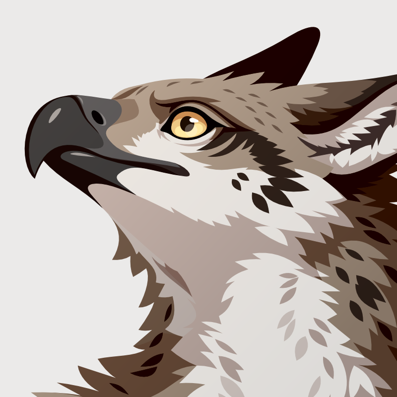
Look at this little guy in my header drgn_flat_heart